Now that the team isn’t working to the tight timescales we were dealing with early on in the project, we wanted to revisit our landing page to see if we could improve the layout.
The card pattern we’ve used to signpost to the various sections has generally tested well, but we wanted to see if the explanatory text under each heading/link was necessary, or whether the link text would be enough to help users identify what those pages might contain.
We also wanted to make the page more scaleable - give ourselves the option of adding more content to the page without increasing the cognitive load, so that it was still easy for users to quickly scan the page to identify the content that was most useful to them.
Since so much content on GOV.UK sites tends to be dark text on a white background, we decided to differentiate the landing page header in a similar way to services such as the National Careers Service and Teaching Vacancies:
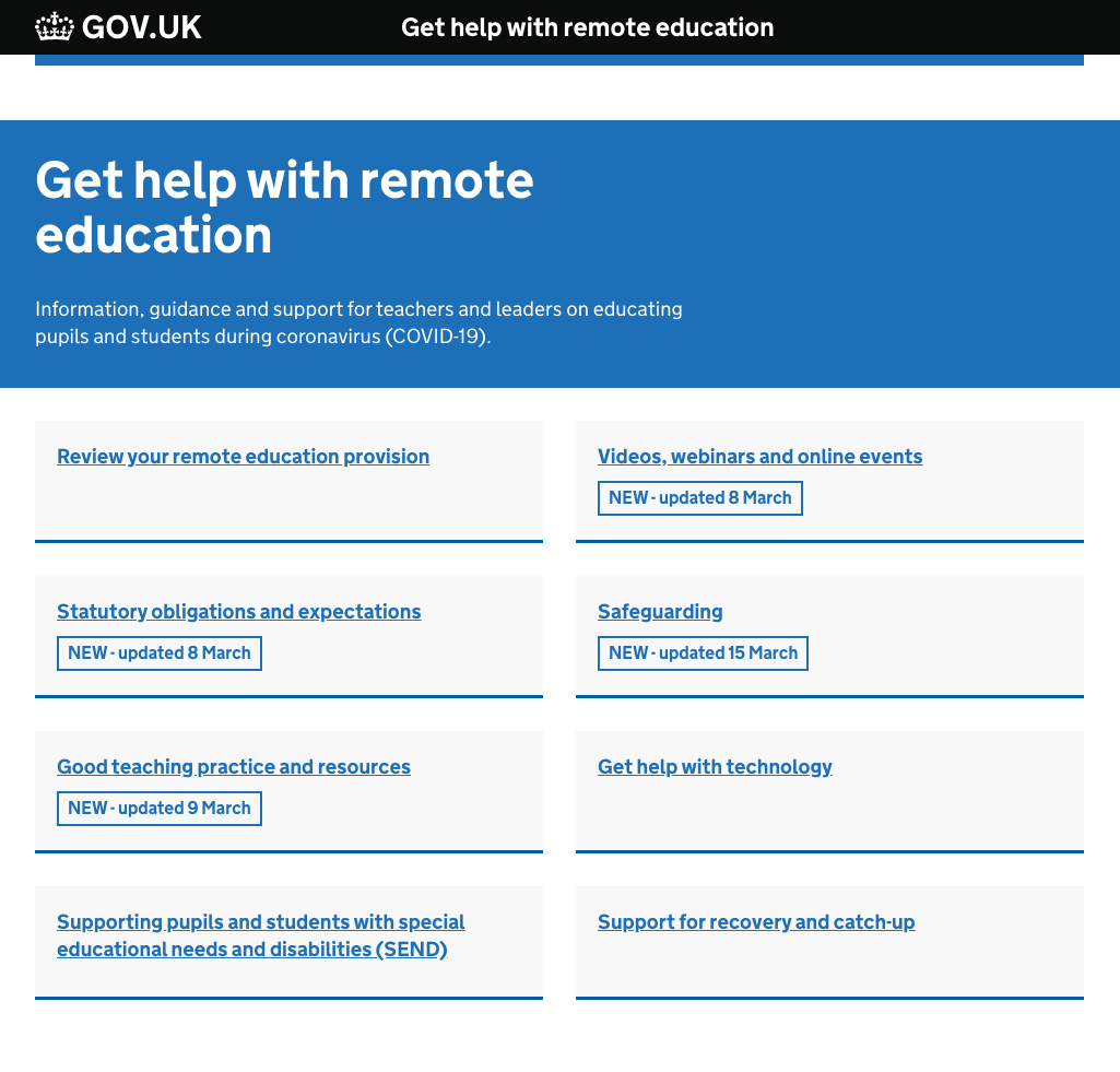
In testing, we saw that users were still able to identify the kind of content likely to be behind each link, even without the summary text that we’ve used previously. It’s also worth noting here that a common finding in user testing GOV.UK services and products is that users generally only scan a page, rather than fully reading the content, so it’s unlikely that users of our live service would be making full use of this summary text anyway.
Following the findings of user testing, the team decided that we should apply these design changes to our live landing page as part of our next sprint.