Most of our user research participants (teachers, headmasters etc) already receive the daily email bulletin sent by DfE to help them keep up to date with anything that might affect them and their school or college.
However, one of the needs we identified through testing ‘Get help with remote education’ was that, even if users were notified by email that a particular page or piece of guidance had been updated, it would be useful to be shown exactly what had been changed or updated when they visited the ‘Get help…’ site.
This needed to be addressed on the initial landing page, and on the content page(s) where the changes had been made.
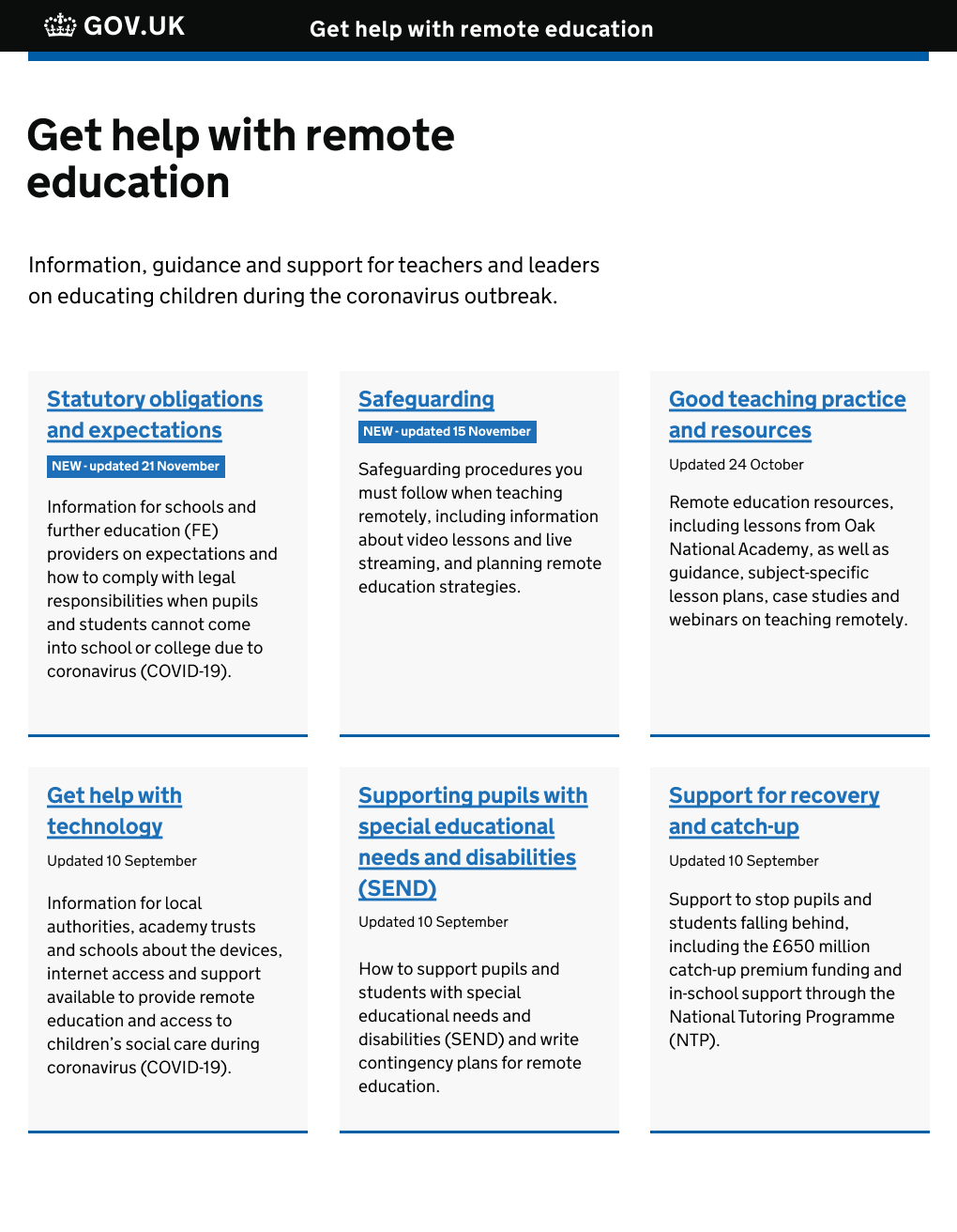
For the landing page we added ‘updated’ meta data to each card, with an additional blue tag to highlight the most recently updated content. For these tags we used the standard gov.uk blue, to avoid any unintended emotional response in users had we chosen, for example, red. We also had to be careful not to use colour alone to convey information, as this has accessibility implications:

On the actual content page, we needed to come up with a bespoke solution for clearly indicating or summarising new/updated content, as there is currently no pattern for this in the gov.uk design system.
We looked at how document changes are shown in popular tools such as Microsoft Word and Google Docs, as well as how a document’s history is displayed for content published with Whitehall Publisher.
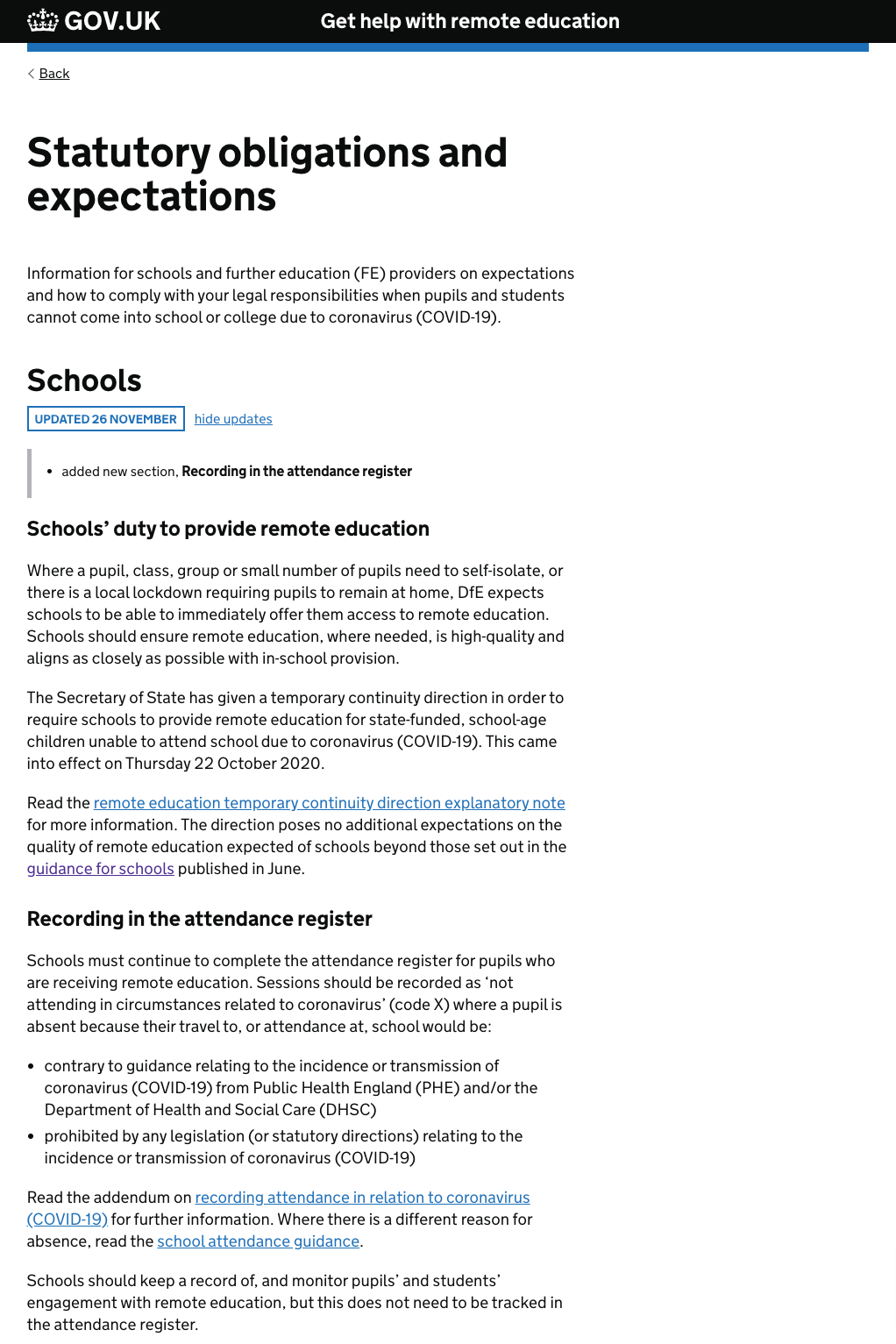
The first iteration was a collapsible element sitting inline within the body of the page, that would show the user a summary of new or updated content:

When we tested these designs, users understood what the blue tags on the landing page meant, and that those pages had been changed or updated recently.
However on the actual content pages, although users were able to easily interact with the ‘show updates’ elements, it wasn’t clear to them exactly where on the page the new or updated content could be found.
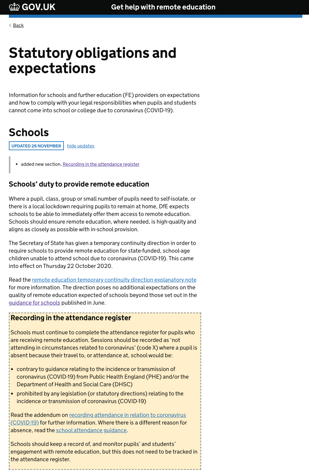
To address this in the next iteration, we added a highlighted container around the relevant section of the page (the section with a yellow background). We also added a text link that led directly to the updated content, to ensure that non-visual users could navigate easily to the updated section:

We haven’t yet been able to get user feedback on this iteration due to lack of testing resource on ‘Get help…’, but we do have some concerns around how useful this pattern is, in different situations. For example, if a page has had several minor updates which are spread throughout the document, it may be that a number of highlighted areas are less effective than if the updates are contained within one section.
Also, if a page has effectively had a complete overhaul, there is a question around whether we would want to apply a visual highlight to the entire document, or just indicate with a text summary that the document has been revised in its entirety.
As soon as time and resource allows we plan to gather further user feedback on this, and in the meantime have added examples of our work to the discussion on the proposed pattern for showing text changes for gov.uk content.