Now that the initial rush to get our site live is over, we thought we should spend some time looking at the IA and how we could improve it.
At a very high level we have two user groups; those in schools, and those in higher education. There was a clear need from the beginning to distinguish our content by these two basic identifiers, which initially was done by simply separating Schools and FE content by headings, as shown below:
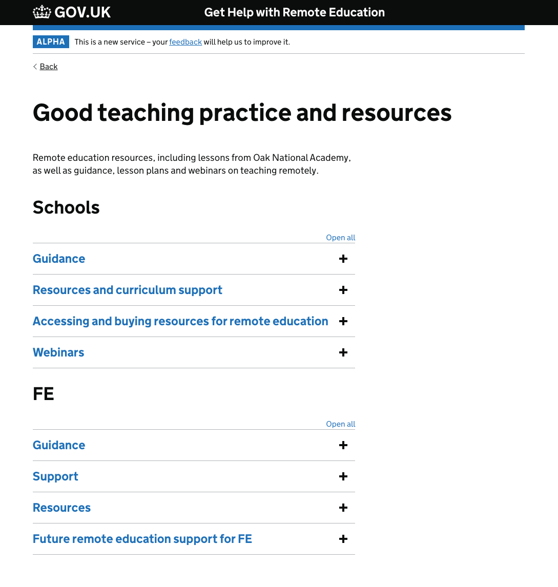
We had also moved the subsections into accordion panels to try and keep the page as compact as possible, but this isn’t necessarily the best solution as user testing sometimes shows users having trouble interacting with accordions.
We knew this page was likely to be updated with even more content in the near future so it was essential that it had a scalable design.
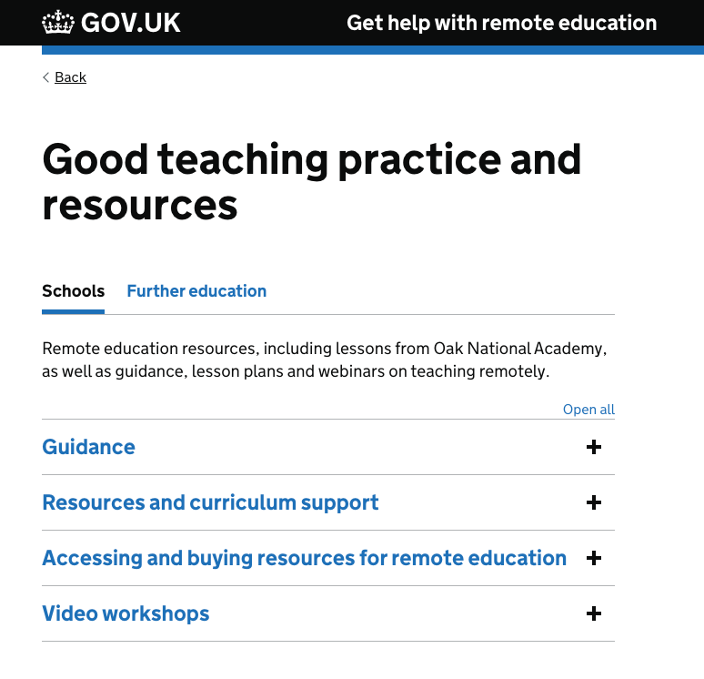
The first step was to split the Schools/FE content out into two separate pages, ideally without impacting on the navigation used on the landing page, which has generally tested very well. We decided to try a sub-navigation pattern on the content page(s).
We tested two different versions of this page, one with accordions for the various subsections and one without:
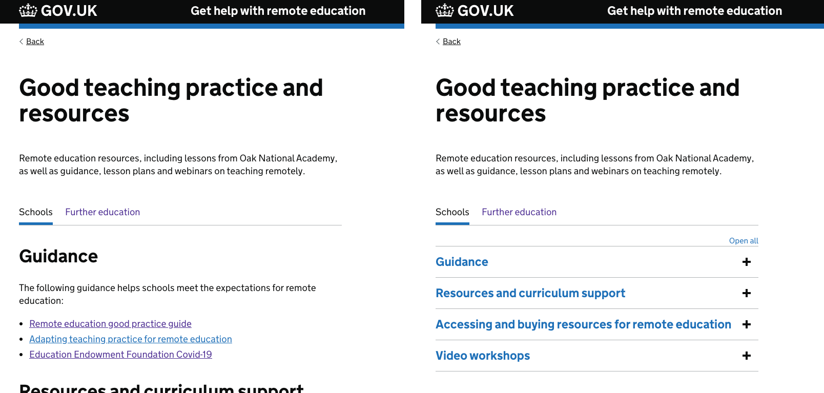
The main aspect of the design we were looking to test was the sub-nav element - whether users understood what this was for and how to use it. What we saw in testing though was that most users didn’t seem to notice it at all, which led to confusion with our FE participants as the page defaulted to the content created for Schools.
The other aspect we were looking to gather more feedback on was the use of accordions to make the page(s) more compact, and whether they caused any confusion or difficulty for our users. What we saw was that all our users (even those with low digital skills) were able to quickly and easily interact with the accordion panels to find the content they were looking for.
On this basis I created a slightly tweaked version of the layout that keeps the accordions, but makes the sub-nav more prominent. We think this will help address the issues we saw in testing: